{ Foundry. - MyFontsorigin.myfonts.com/s/aw/original/110/0/56715.pdf · { Foundry. Lian Types ......
59
Transcript of { Foundry. - MyFontsorigin.myfonts.com/s/aw/original/110/0/56715.pdf · { Foundry. Lian Types ......


{ Foundry. Lian Types
{ Website. http://www.liantypes.com.ar
{ Owner/Designer. Maximiliano Rodolfo Sproviero
{ Address.Campana 4214, PC. 1419, Ciudad de Buenos Aires, ARGENTINA.
{ Phone. 011-54-11-45720553
{ E-mail. [email protected]

{ 01 } About
{ 05 } Project Reina Pro
{ 07 } Meeting Reina Pro
{ 21 } Technical
{ 51 } Posters
{ 57 } The Performers
{ 77 } Acknowledgments
{ 81 } More Projects
{ 01 }

My name is Maximiliano R. Sproviero, from Ciudad de Buenos Aires, Argentina. I am about to get a degree in Graphic Design in Universidad de Buenos Aires.Being 23 years old, I can’t help thinking that I am really young to present myself as a -typographer-, but I believe that it would be hard to find a person of my age with the obsession that I feel for this subject.Like everyone of us, I am in a process: fortunately, I still have a lot to learn and I really enjoy that. It is wonderful to look at my very first attemps in Typography; those from early 2006, when I started the career at college. There I discovered that calligraphy and I were, in a way, relatives: Once I started practicing the ductus of each style, I could not stop. It rapidly became an addiction, a good one.Those first exercises, including my first font-design, are a direct proof of that process I was referring above.
Today, I am proud to say that some of my dreams have become true. I believe that one needs time and e�ort in order to achieve whatever one wants.Since I started working as a type-designer in 2008, I have been mentioned several times in many newsletters of some of the most popular font-vendor sites over the world, being awarded with the title “top 10 fonts of the year” two times (in 2009 and 2010 at myfonts.com).I was also invited to participate with my typographies in
2
{ 01 } About
some publications, projects, books and magazines from di�erent countries around the world, such as Germany, Spain, England and the States.However, one of the most unforgettable things that I have had the good fortune to live was when I visited Boston, USA, in 2010, where the most important Calligraphy conference1 was held. It was an entire week of seeing letters and letters, surrounded by the best lettering artists of the world2, a week of being delighted by their amazing soul traces. All the things I learnt there in Boston and through the years, rea�rmed the idea of type-designing that I still have nowadays: The key for making good type is making good calligraphy. There is nothing else. The secret of becoming a successful typographer is at the bottom of the bottle of ink.
In order to explain the goals I have when I type-design, I would like to explain what I think is happening nowadays in the world of Graphic Design. We all know that the career is in a way new3. This means it learns things everyday. Graphic Design is growing, therefore, it needs every -part- of it to grow. Here we find Typography: One of the most important parts of Graphic Design.One thing leads to another; we are getting conscious that if there’s a more mature idea of general design, then it is a
must to have a more mature idea of type-design specifically.It is now, more than ever, our debt to give typography the importance that it deserves, at the moment of designing a random piece.I believe that fonts really talk. I think that sometimes (or maybe always), the fact of choosing carefully a font could solve an entire piece of design: Each glyph, with its curves and its subtle decisions will be a reflex of what we want to say in whatever our project of design is4.
In conclusion, my goal is satisfying those needs. I know that my fonts could be chosen to be the protagonists of a system, so I work hard in order to make them the most complete I can, giving in general, lots of alternates for each glyph in order to give the user the chance of playing at the moment of designing.
The written word or more specifically the letter itself, has an enourmous beauty and potential if it is well-done.
Hope you enjoy the next pages!
[MAXIMILIANO R. SPROVIERO]3 4
{ About
1. Odyssey 2010 Calligraphy Conference30th International Gathering of Lettering Artists (July 24th - 31st , 2010)
4. A good example of this could be when companies want their logo made entirely with typography, without any other graphic.
2. Lettering artists such as:Julian Waters, successor of Hermann Zapf; Sheila Waters, her mother; Georgia Deaver, the master of brush lettering; Carl Rohrs; Peter Thornton; Thomas Hoyer; Rob Leuschke; Denis Brown; and many more.
3. Graphic DesignIn Argentina, “Diseño Gráfico” exists since 1985.
{ 05 }

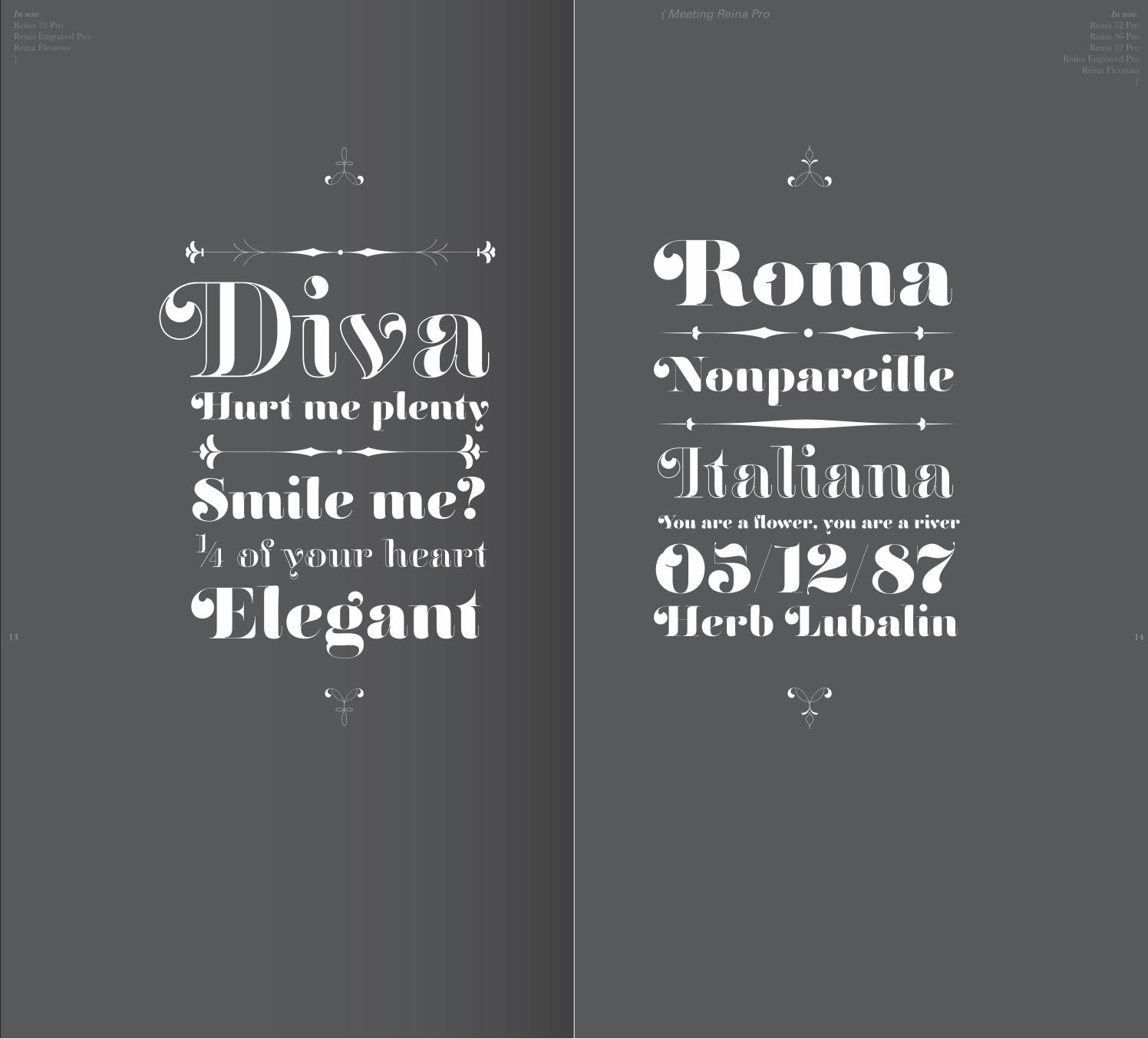
Reina Pro is how I call this project.Reina is the spanish word for Queen and, believe it or not, it was a really hard task to choose its name. I wanted a name which reflected sovereignty in some way, due to the enveloping atmosphere and the sensation of greatness that can be felt when using it.
Reina, a didone font, inspired in the sweet letters of calligraphy and typography masters of our past; such as Didot, Bodoni and the incredible Herb Lubalin.Aiming to incorporate the decorative accolades from the Blackletter and Copperplate styles of calligraphy into a Modern Roman typeface.
I began designing this project about a year ago, with the idea of making a display font with high-contrasted strokes. I wanted to make it playful, yet formal: While none of its alternates are activated it can be useful for short to medium length texts; and when the user chooses to make use of its open-type decorative glyphs, it can be useful for headlines with dazzling results.
Next pages will show Reina in use and will explain some of its features which I think it’s worth to understand.
[MAXIMILIANO R. SPROVIERO]6
{ 05 } Project Reina Pro

{ 07 }

8
{ 07 } Meeting Reina Pro
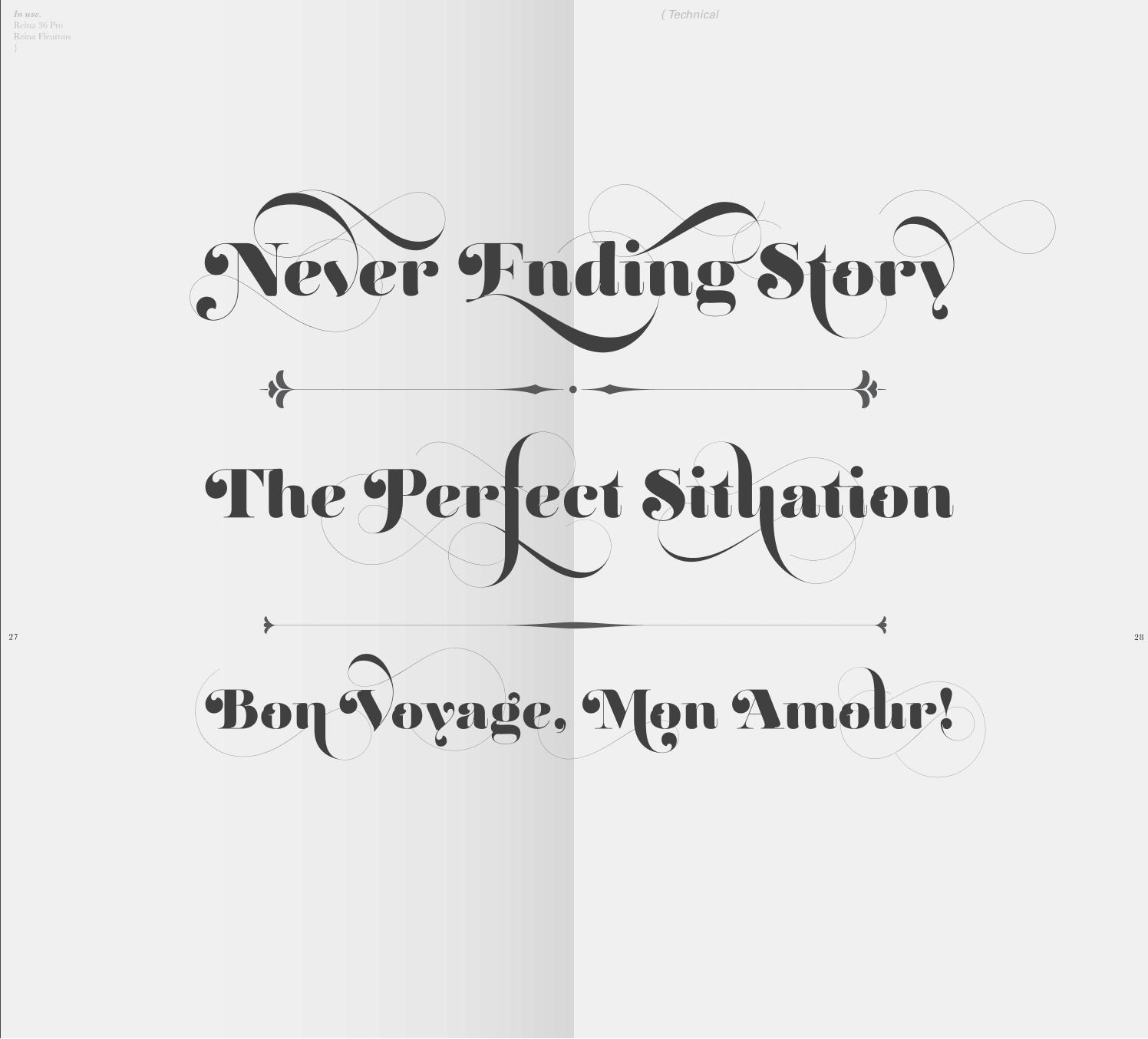
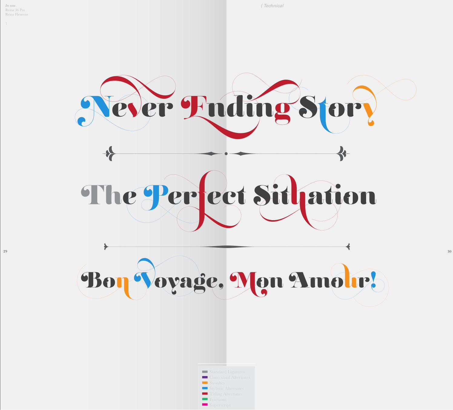
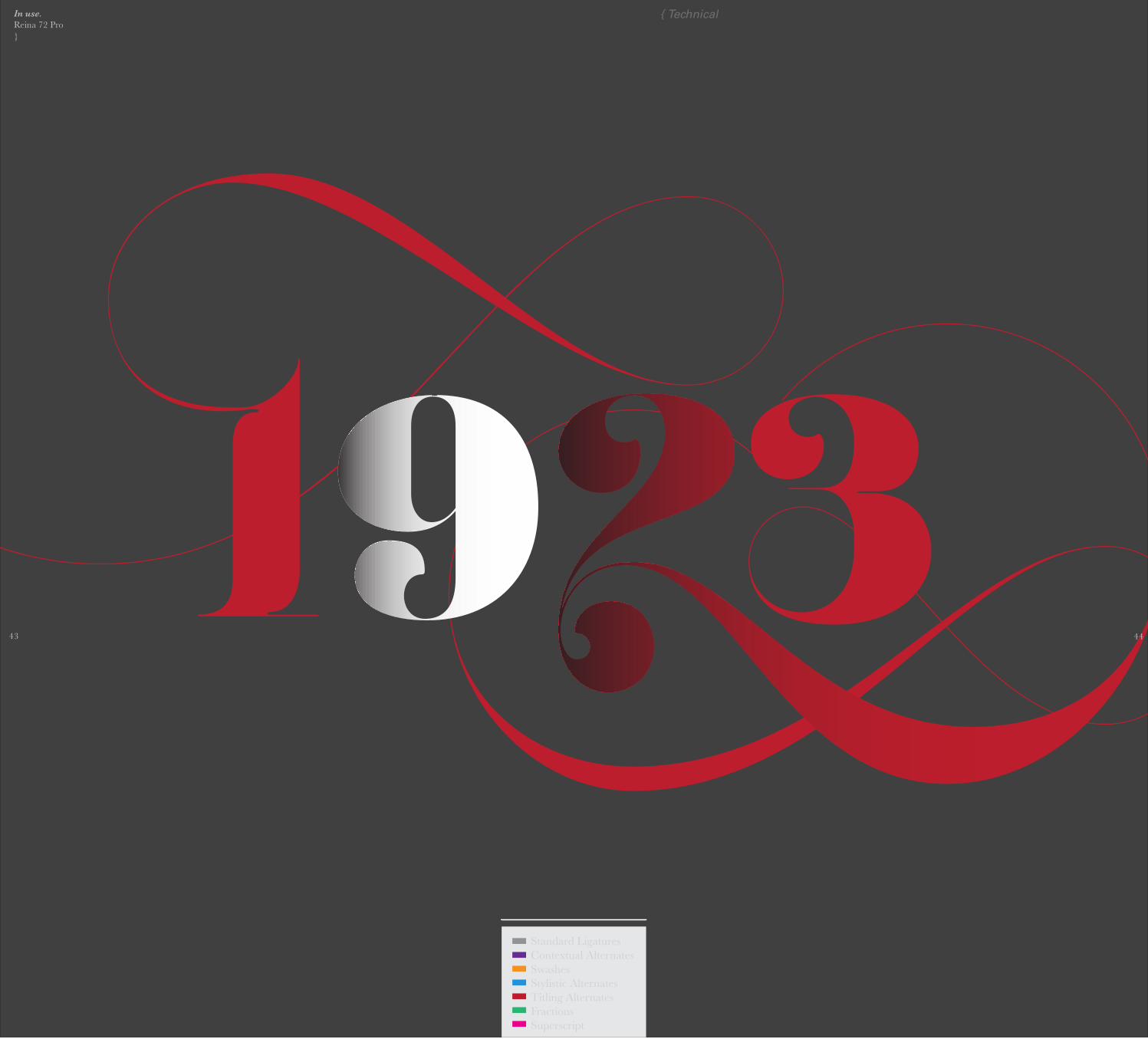
Reina Pro is a family with many members. They were born in order to help the user in almost every circumstance.I took my time to design the necessary variants of Reina in order to achieve better results when printing. The main members are: Reina 72 Pro, prepared for display sizes; Reina 36 Pro, for medium sizes; and Reina 12 Pro, the best for text or decorative words in small size.Each of these members have variants inside, which are open-type programmed: The user decides which glyph to alternate, equalizing the amount of decoration wanted.
I have been always infatuated with engraved roman typefaces, and this was the reason I created Reina Engraved Pro, which has the same features than the variants mentioned above.
The family also contains variants which were made exclusively for decoration. These are: Reina Words, a set of the most common words used in english, german, italian, french and spanish; Reina Capitals, which consists in a big set of ornamented capitals; and Reina Fleurons, those little friends which always help to embellish our work.
Enjoy!

In use. Reina 72 ProReina Fleurons}
In use. Reina Engraved Pro
Reina Fleurons{
9 10
{ Meeting Reina Pro

In use. Reina 72 ProReina 36 ProReina Engraved Pro}
In use. Reina 72 ProReina 36 Pro
Reina Engraved ProReina Fleurons
{
11 12
{ Meeting Reina Pro
In use. Reina 72 ProReina Engraved ProReina Fleurons}
In use. Reina 72 ProReina 36 ProReina 12 Pro
Reina Engraved ProReina Fleurons
{
13 14
{ Meeting Reina Pro

In use. Reina Engraved ProReina Fleurons}
{ Meeting Reina Pro

In use. Reina 12 ProReina Engraved ProReina Fleurons}
17 18
July 2011
{ Meeting Reina Pro

In use. Reina Fleurons}
{ Meeting Reina Pro

{ 21 }

Reina Pro is open-type programmed in order to make things easier to the user.I recommend using applications such as, Adobe Illustrator®, to be in sintony with Reina.
It is possible to see all the characters of the font when opening the Glyph Panel.
{note} click over a random character and all its variants will appear.
Others prefer the Open-Type palette.
{note} click over the buttons and characters will instantly alternate.
22
{ 21 } Technical

In use. Reina 72 Pro}
23 24
{ Technical

In use. Reina 72 Pro}
{ Technical
25 26
Standard LigaturesContextual AlternatesSwashesStylistic AlternatesTitling AlternatesFractionsSuperscript
In use. Reina 36 ProReina Fleurons}
{ Technical
In use. Reina 36 ProReina Fleurons
}
{ Technical
29 30
Standard LigaturesContextual AlternatesSwashesStylistic AlternatesTitling AlternatesFractionsSuperscript

In use. Reina Engraved Pro}
{ Technical
31 32

In use. Reina Engraved Pro}
Standard LigaturesContextual AlternatesSwashesStylistic AlternatesTitling AlternatesFractionsSuperscript
{ Technical
33 34

In use. Reina Fleurons}
{ Technical

In use. Reina 36 ProReina Engraved ProReina Words 1}
{ Technical
37 38

In use. Reina 36 ProReina Engraved ProReina Words 1}
{ Technical
39 40
Standard LigaturesContextual AlternatesSwashesStylistic AlternatesTitling AlternatesFractionsSuperscript

In use. Reina 72 Pro}
{ Technical
41 42
In use. Reina 72 Pro}
{ Technical
43 44
Standard LigaturesContextual AlternatesSwashesStylistic AlternatesTitling AlternatesFractionsSuperscript

In use.Reina 72 ProReina 36 ProReina 12 ProReina Engraved ProReina Fleurons}
{ Technical

In use.Reina 72 ProReina 36 ProReina 12 ProReina Engraved ProReina Fleurons}
{ Technical
Standard LigaturesContextual AlternatesSwashesStylistic AlternatesTitling AlternatesFractionsSuperscript
In use.Reina Fleurons}
{ Technical

In use.Reina 12 ProReina Engraved ProReina CapitalsReina Fleurons}
{ Posters
51

In use.Reina 12 ProReina 36 ProReina Engraved ProReina Words 1Reina Fleurons}
{ Posters
52

In use.Reina 12 ProReina 36 ProReina 72 ProReina Engraved ProReina Words 1Reina Fleurons}
{ Posters
53

In use.Reina Fleurons}
* Some filet combinations
†
{ Posters
54

* Some vignette combinations
{ Posters
55

{ PostersIn use.Images using Reina Pro}
56

{ 57 }

58
{ 57 } The Performers
Now it’s time to wave goodbye.The performers of Reina Pro hope you enjoied this trip.Next pages will show each glyph that made this perfomance possible.It is my desire that we meet once again in the near future.
Cheers!
[MAXIMILIANO R. SPROVIERO]

The stellar participation of:
A B C D E F G H I J K L MN O P Q R S T U V W X Y Zabcdefghij�lmnopqrstuvwxyz
·“{[(`¡¿0123456789?!´)]}”·&
†\«@¶¼½¾ƒ#»/†k--1--K
with these little friends as: “Diacritics”áäãąâăāåà
the ones which ma�e reading easier:. , ; :
and our always beloved?$
*
{ The Performers
59 60

In use.Reina 36 Pro}
* Letters playing di�erent roles
†
a � � �
b � � � �
c � � �
d � � �
e � �
f �
g � � �
h � � �
i � � �
� � � � k
l � �
m � �
{ The Performers
61

In use.Reina 36 Pro}
* Letters playing di�erent roles
†
q � � �
s � � �
t � � �
u � � �
v � � �
w � � �
x � � �
y ¢ £ ¤
z ¥ ¦ §
{ The Performers
62

In use.Reina Engraved Pro}
“�e Engraved Ampersand”
��:
{ The Performers
63 64

In use.Reina 36 Pro}
* Capitals playing di�erent roles
‡
A ¨ ©
B ª ¬
C ® ¯
D ° ±
E ² ³ µ
F ¸ ¹
G º À
H Á Â
I Ã Ä
J Å Æ
K Ç È É
L Ê Ë
M Ì Í
{ The Performers
65

In use.Reina 36 Pro}
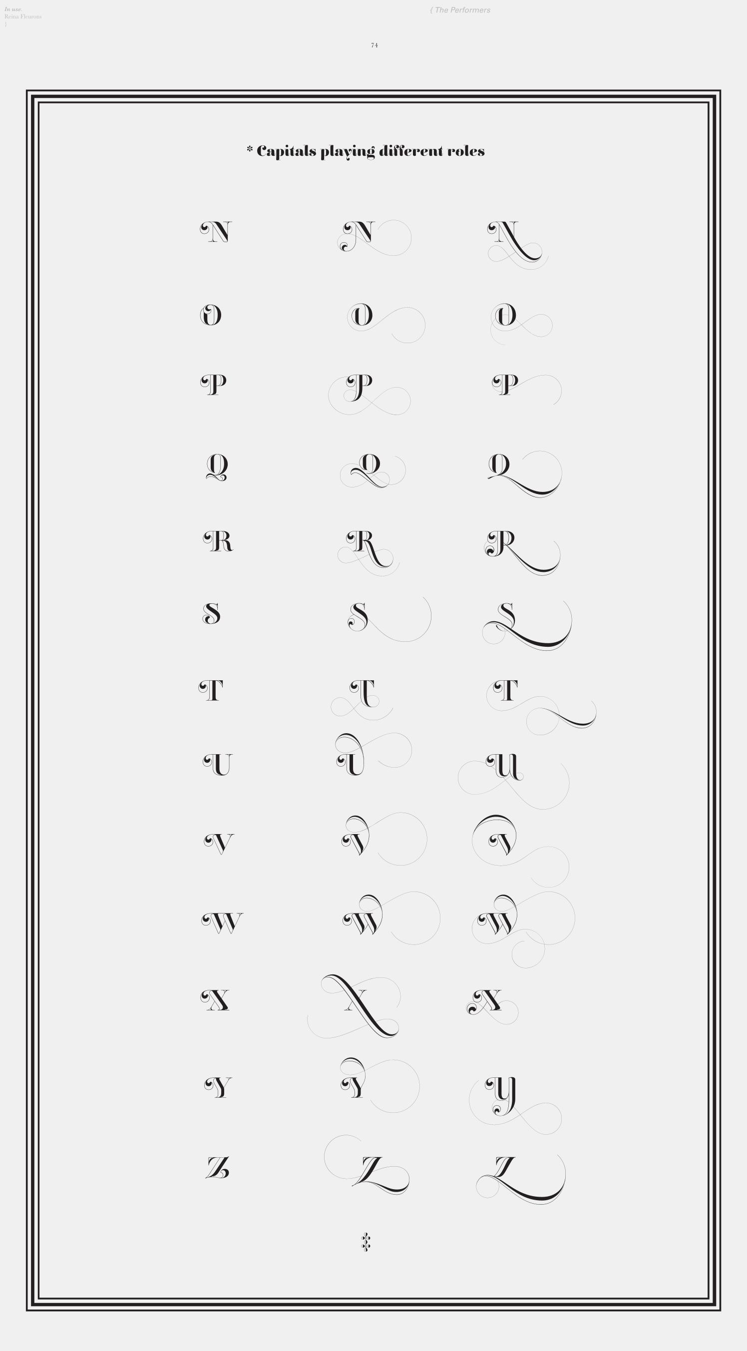
* Capitals playing di�erent roles
†
N Î Ï
O Ð Ñ
P Ò Ó
R Ô Õ
S Ö ×
T Ø Ù
U Ú Û
V Ü Ý
W Þ ß
X æ ç
Y è é
Z ê ë
{ The Performers
66
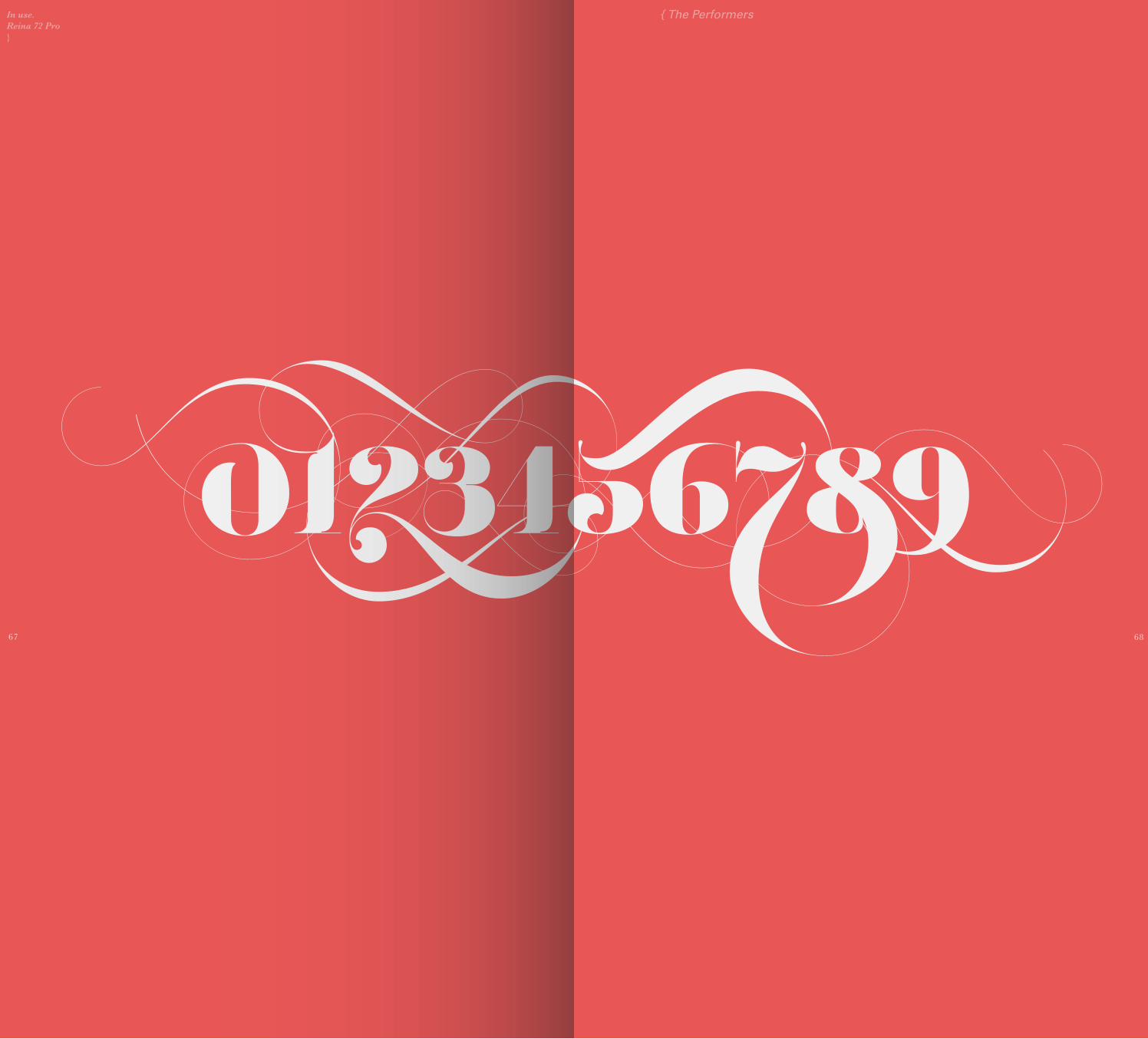
In use.Reina 72 Pro}
{ The Performers
67 68

In use.Reina Engraved Pro}
* Engraved Letters playing di�erent roles
†
a � � �
b � � � �
c � � �
d � � �
e � � �
f � �
g � �
h � �
i � � �
� � � � k
l � � �
m � �
{ The Performers
69

* Engraved Letters playing di�erent roles
In use.Reina Engraved Pro}
†
n � �
o � � �
p � � �
q � � �
r � � �
s � � �
t � � �
u � � �
v � � �
w ¡ ¢ £
x ¤ ¥ ¦
y § ¨ ©
z ª « ¬
{ The Performers
70

In use.Reina 72 Pro}
“�e Ampersand Sovereign”
��:
{ The Performers
71 72

In use.Reina Fleurons}
* Capitals playing di�erent roles
‡
A ¯ °
B ± ²
C ³ ´
D µ ¶
E · ¸ ¹
F º »
G ¼ ½
H ¾ ¿
I À Á
J Â Ã
K Ä Å
L Æ Ç
M È É
{ The Performers
73
In use.Reina Fleurons}
* Capitals playing di�erent roles
N Ê Ë
O Ì Í
P Î Ï
R Ð Ñ
S Ò Ó
T Ô Õ
U Ö ×
V Ø Ù
W Ú Û
X Ü Ý
Y Þ ß
Z à á
‡
{ The Performers
74
In use.Reina Fleurons}

{ 77 }

Ok, here we are. To be honest, I would have preferred to make this guide a bit longer. Fortunately, you still can discover Reina’s beauty wherever and whenever you want.
So, to conclude, I would like to say THANKS! to everyone who looked every page of this book, whether you like it or not, I appreciate that.
Thanks to those who are always there supporting what I do: My family, who is indeed full of mathematicians, and actually think Bodoni is the same as Helvetica. Thanks to Sabrina M. Lopez “Sav”, my partner, my friend: Get ready for her new upcoming releases. She is the next Bickham!Thanks Rob Leuschke! a great friend since we met in Boston in 2010. Excellent type and lettering designer.Thanks Laura “Laurita” Worthington! An awesome woman, my friend, who last month sent me lots of calligraphy supplies by mail! She wants me to grow, always willing to help me.Thanks to all of my friends of Argentina and the world, I don’t know if they are actually many, but I believe in them, they believe in me, and in all the e�ort I’m making here...
[MAXIMILIANO R. SPROVIERO]
{ 77 } Acknowledgments
78
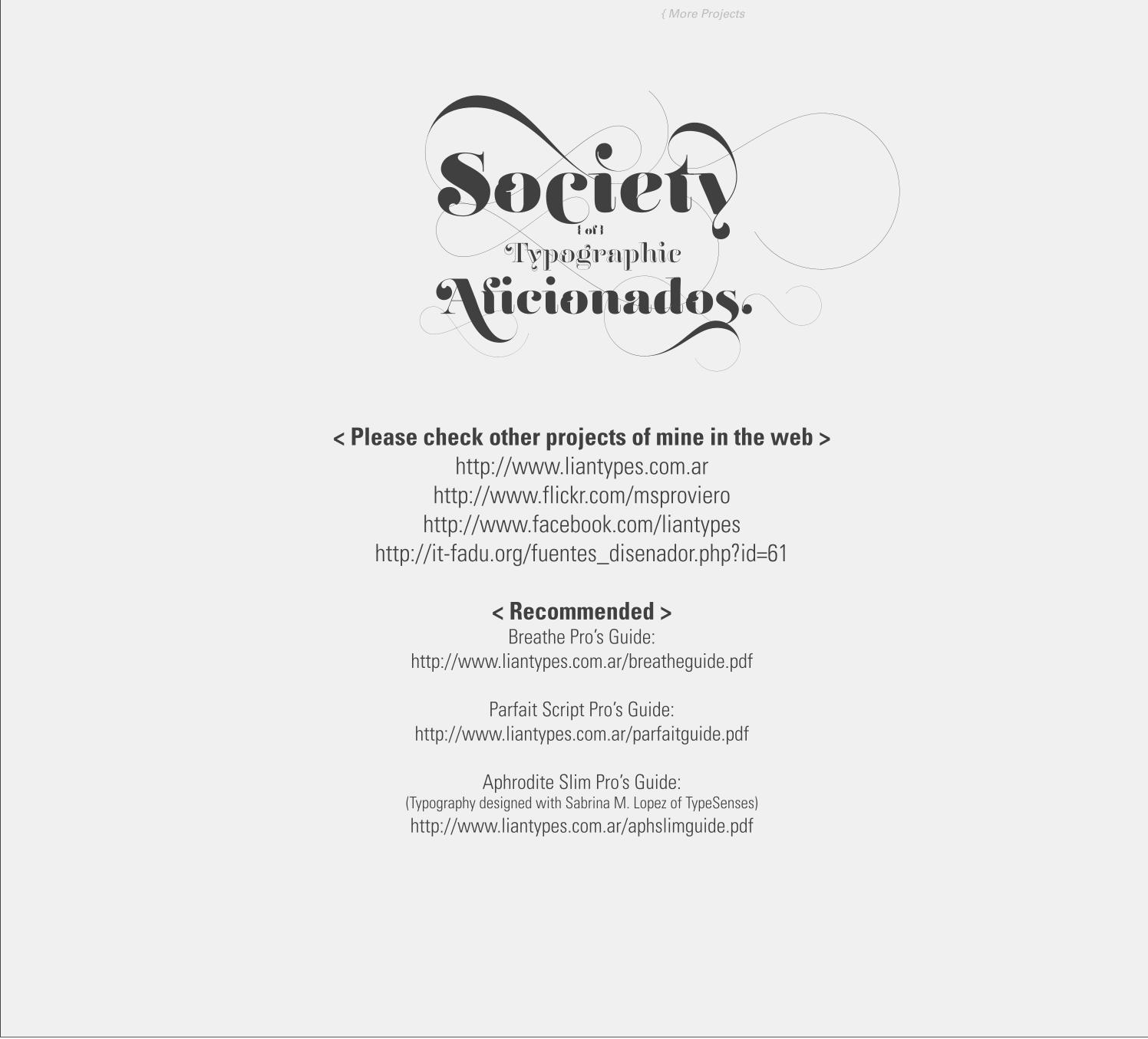
< Please check other projects of mine in the web >http://www.liantypes.com.ar
http://www.flickr.com/msprovierohttp://www.facebook.com/liantypes
http://it-fadu.org/fuentes_disenador.php?id=61
< Recommended >Breathe Pro’s Guide:
http://www.liantypes.com.ar/breatheguide.pdf
Parfait Script Pro’s Guide:http://www.liantypes.com.ar/parfaitguide.pdf
Aphrodite Slim Pro’s Guide:(Typography designed with Sabrina M. Lopez of TypeSenses)http://www.liantypes.com.ar/aphslimguide.pdf
{ More Projects
{ Project Reina Pro by Maximiliano R. Sproviero }